I redesigned two products, built a design system, mentored two designers, and led the design team at Employee Navigator.
Our products deliver benefits to over 13,000,000 employees working at 150,000 businesses across the United States. With a 97% customer satisfaction rating, our customers are highly engaged in shaping the best-in-class user experience for benefit administrators across the United States.
As a design generalist, I lead design efforts across the marketing, product, and engineering teams. I’m responsible for Employee Navigator’s brand, design team, design process, and the overall product experience. I delivered grounded and feasible solutions by working closely with developers, stakeholders, and the product team. I enjoy working closely with users to understand their needs, using real input and observations to shape and inform our outputs.

SaaS Software for Benefit Administration
Employee Navigator’s core product allows benefits administrators to manage their brokerage and HR teams to manage employees and their benefits in a cloud-based SaaS B2B platform.
- Led major UX/UI refactor in 2023, identifying and shipping fixes for 100+ UX & UI issues identified from user feedback.
- Released a new & improved visual design language in 2024, wrapped in major update to our design system.
- Regularly design user-facing features and provide design solutions across the product development process. Ship 10-12 features per year.

SaaS Software for Employee Experience
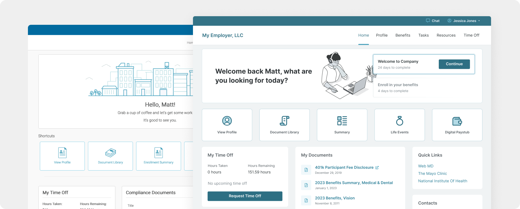
Employee Navigator allows employees of any company on our platform to login, select and manage benefits, view documents and messages, request or manage PTO, and complete a variety of HR-assigned tasks. This experience is maintained as a separate product.
- Developed & implemented a new design language with updated colors, iconography, typography, less borders, and more.
- The goal was to introduce an updated theme that was familiar & comfortable to existing users.
- We grouped over 120+ UX/UI issues into 11 common themes, and worked alongside a variety of product managers & developers to implement user-facing solutions and fixes.

Created & Managed Design System
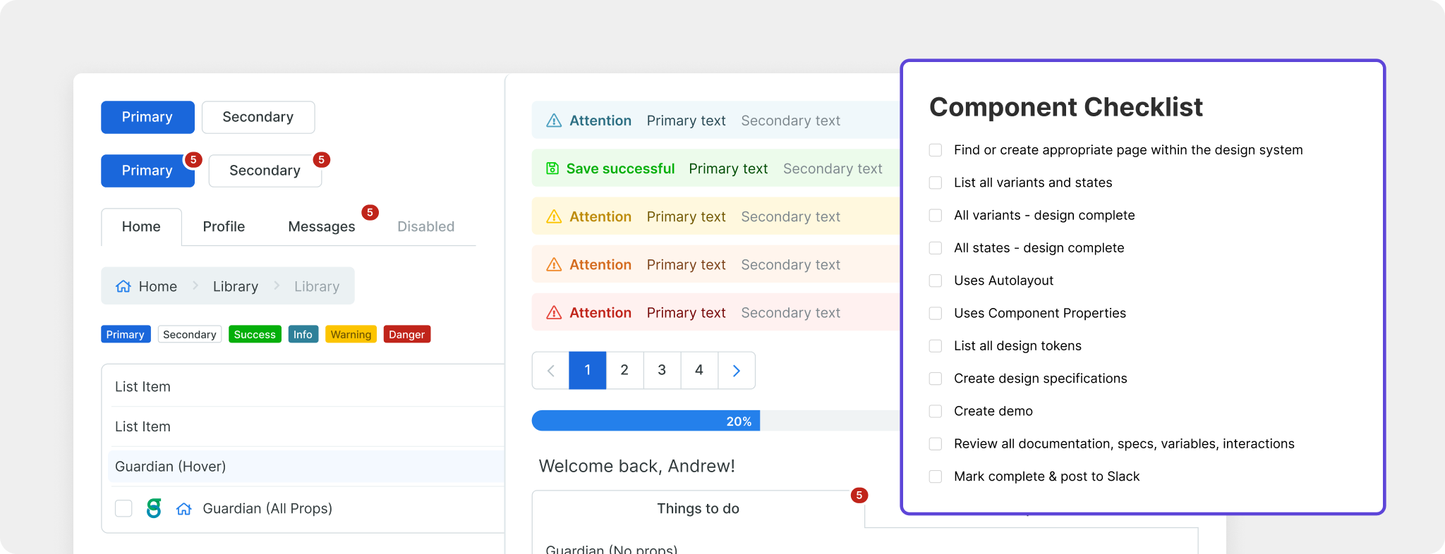
Developed a series of patterns and components that could be used by designers or developers. Created and maintained 30+ synced Figma & Vue-based Storybook components by collaborating with frontend engineers.
- We maintained foundational systems (color, icons, typography, etc.), implemented design tokens, and developed a series of reusable patterns (for tables, forms, sidebars, etc.).
- Created linked Figma libraries for all marketing and product design work.
- The goal was to give a shared language and more collaborative workflows for designers & developers.

Managed UX Research
Building a successful digital product requires you continually learn from your users. By utilizing UX research, we’re able to identify the root cause and build workflows, interactions, and experiences that our customers love, all before writing a single line of code.
- Created EN First Look, a research program that allowed our users to opt-in for beta tests & UX product research sessions. Served as an internal CRM for research participants. Both users and PMs loved this program. Based on Gitlab First Look.
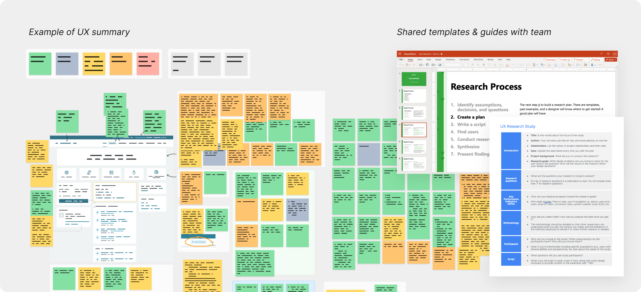
- Shared resources, best practices, and templates with product team. Conducted hands-on learning sessions and continually advocated for informing design decisions with user research.
- Regularly conducted & shared user research findings with product team.
