I designed a product, crafted the corporate brand, and helped an early-stage startup incorporate design thinking & UX research.
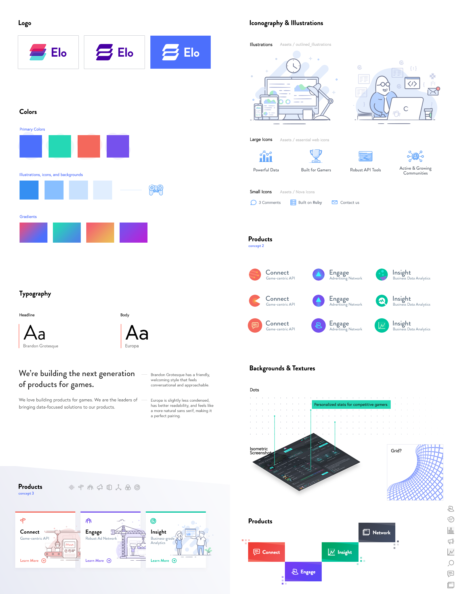
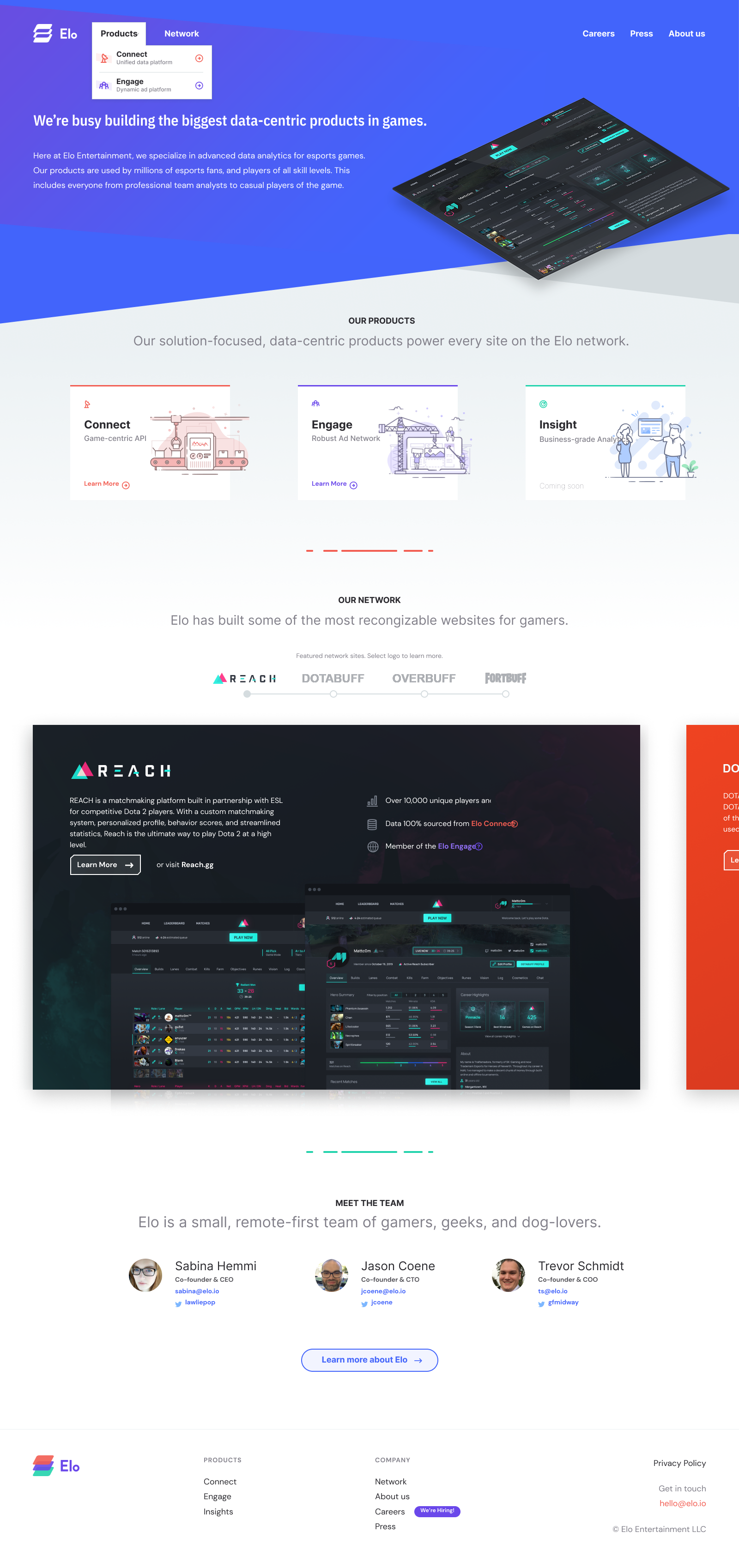
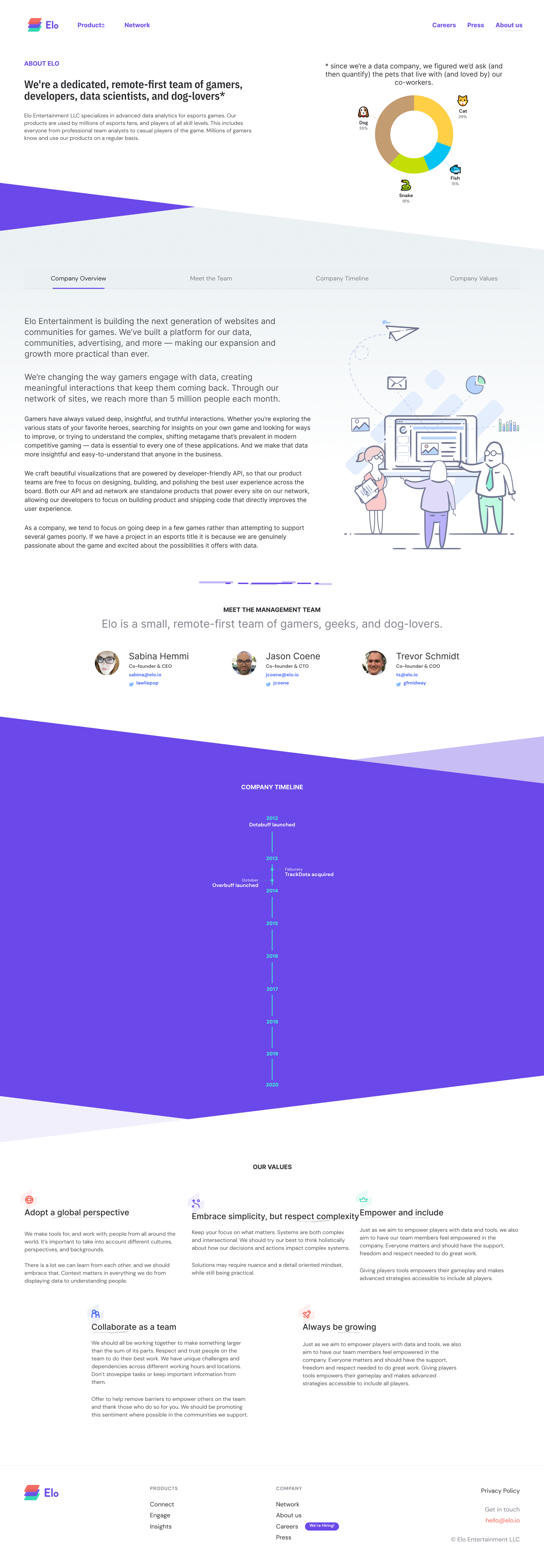
Elo specializes in building consumer-facing data analytics for multiplayer games. Elo’s products are used by millions of esports fans and players of all skill levels. Some websites they’ve built and developed include Dotabuff, Speedrun, Overbuff, and Valorbuff.
I joined Elo as their first full-time designer. The CEO & CTO had experience in delivering consumer-facing websites and products used by of unique millions end-users every month, and understood the value of design-and-developer collaboration. Working together was a great learning experience. I brought my experience in mapping, GIS, and B2B analytics tools; and Elo’s leadership proactively mentored the team through every step of planning, designing, and developing user-friendly B2C products and brands. We adapted and customized the design sprint process to research, design, and prototype our products.
Reach
Branding & Marketing
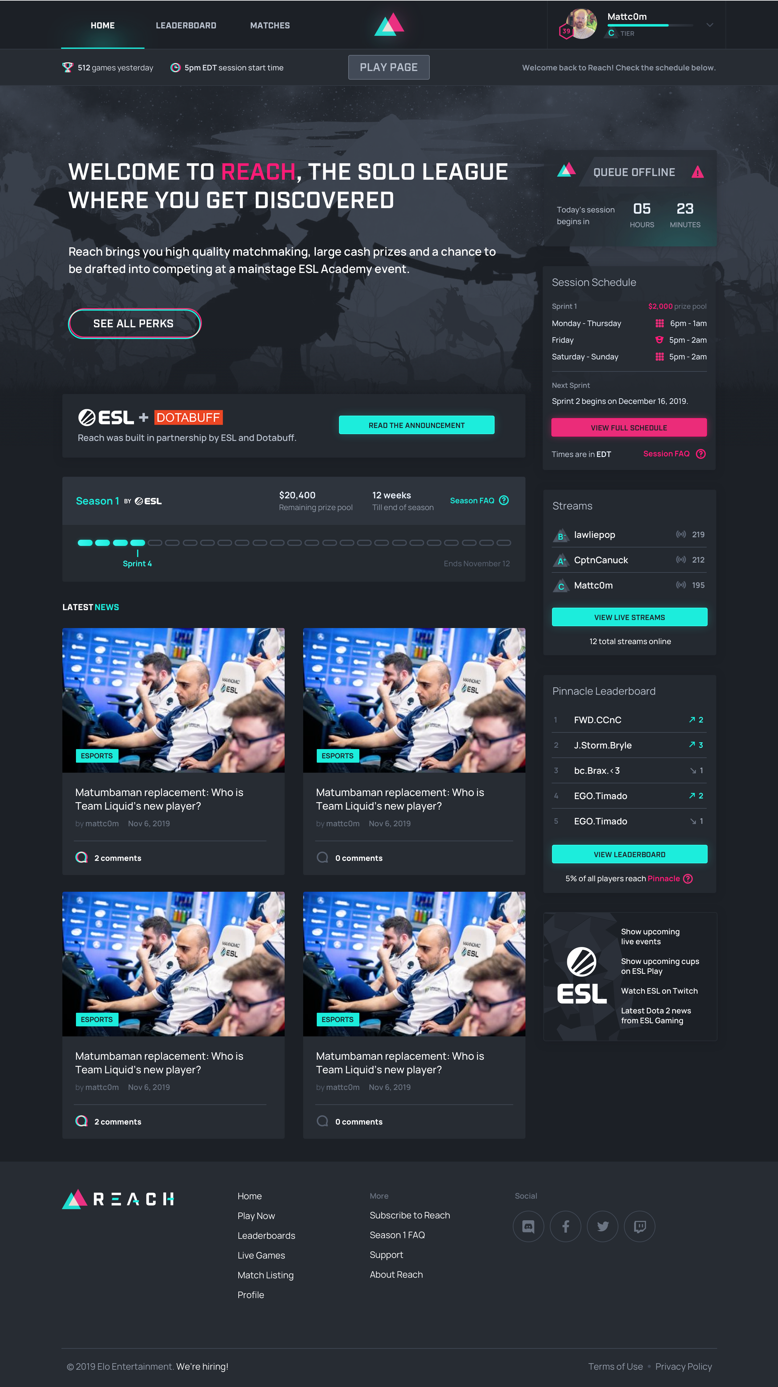
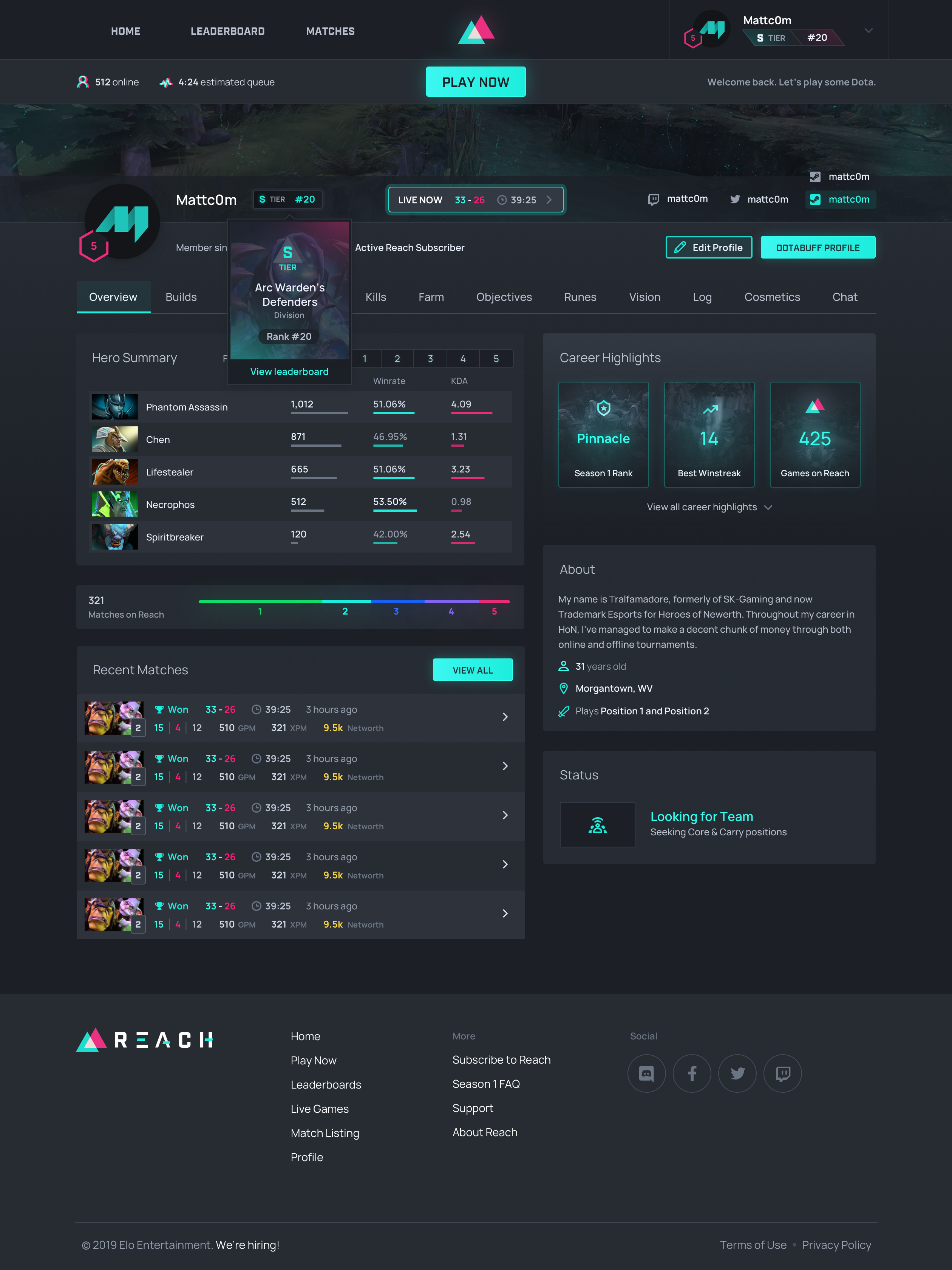
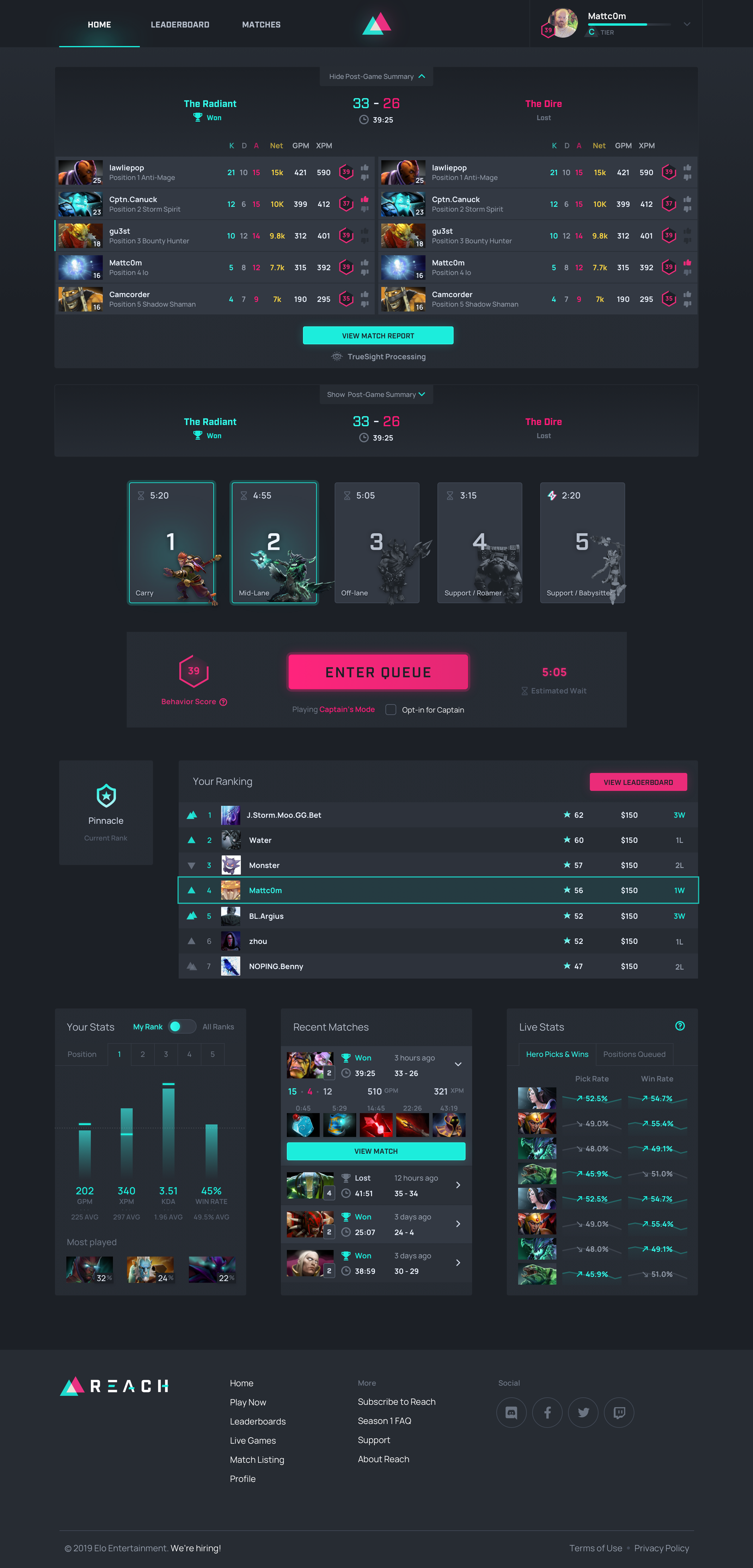
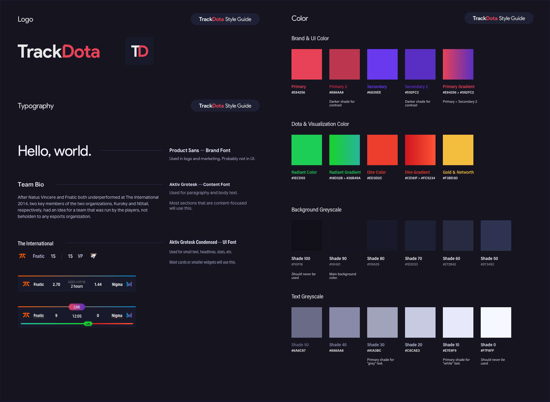
Reach aimed to stand out in the esports and gaming website crowd by creating a bold brand with unexpected colors and familiar metaphors. The logo depicted two teams battling on the in-game map, with each color representing a game “side.” We crafted a duo-tone brand based on this concept.
During our UX research sessions, we also explored branding and visual design questions we had, shaping our brand with iterative feedback. This research led us to evolve from a flat UI style to a dynamic, depth-driven visual approach. Despite the futuristic and effect-heavy appearance, this design resonated with our audience, conveying a sense of professionalism and trustworthiness.
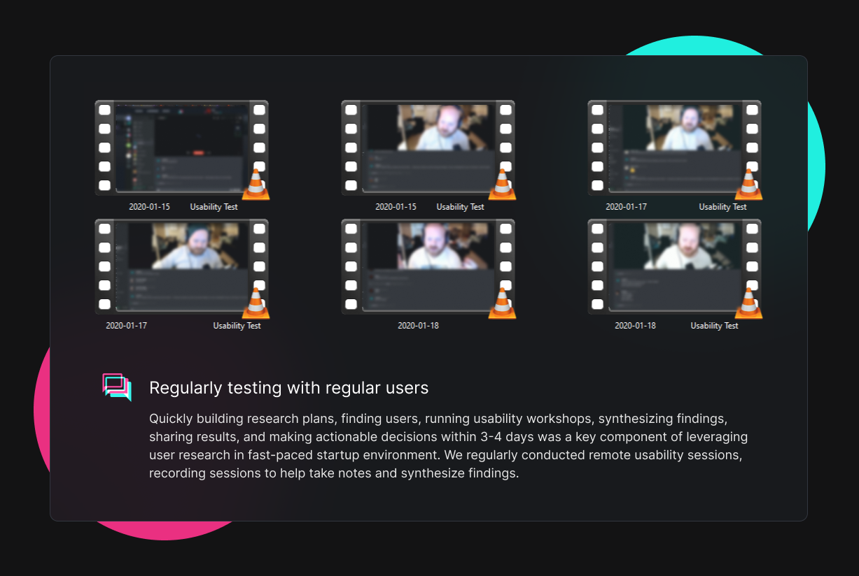
UX & User Research
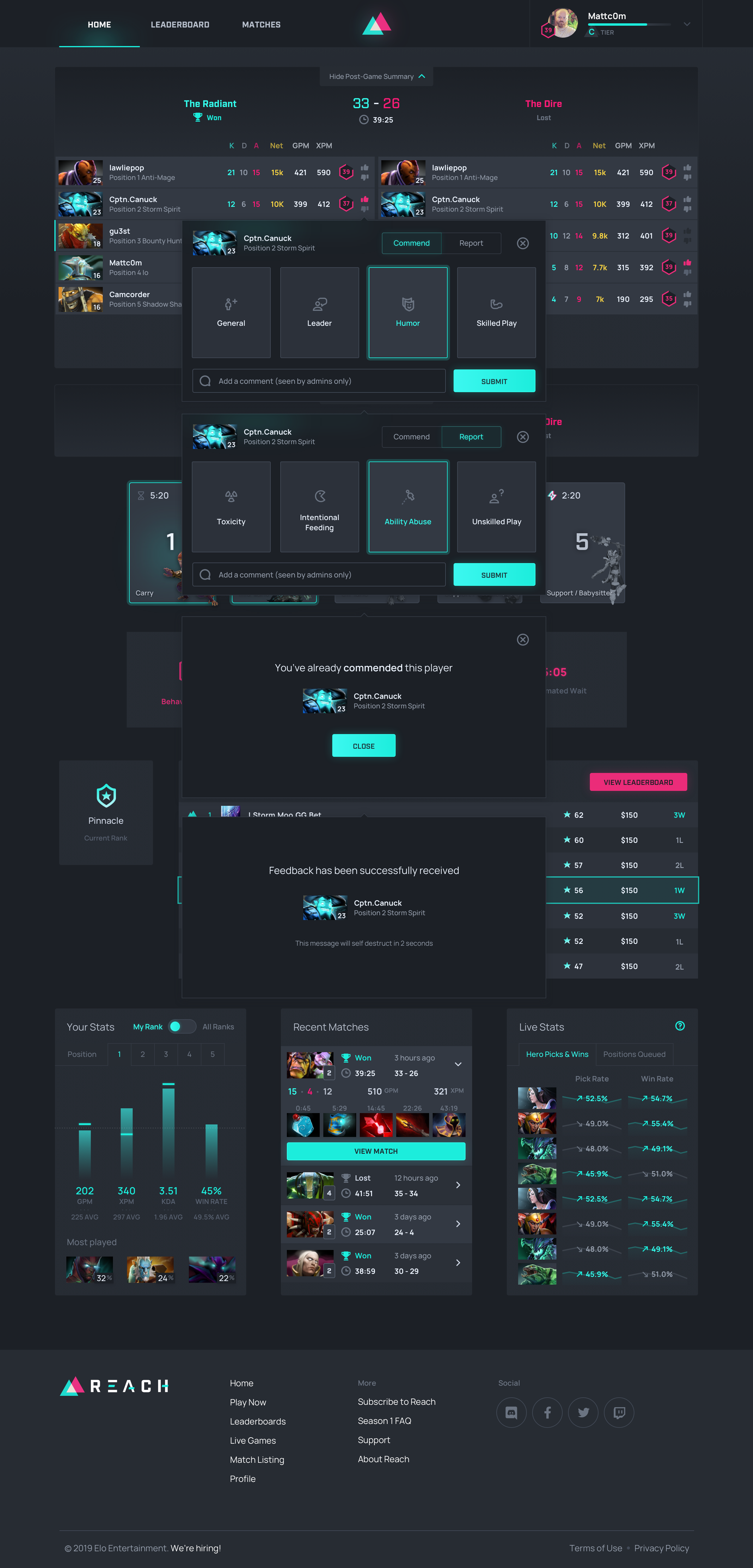
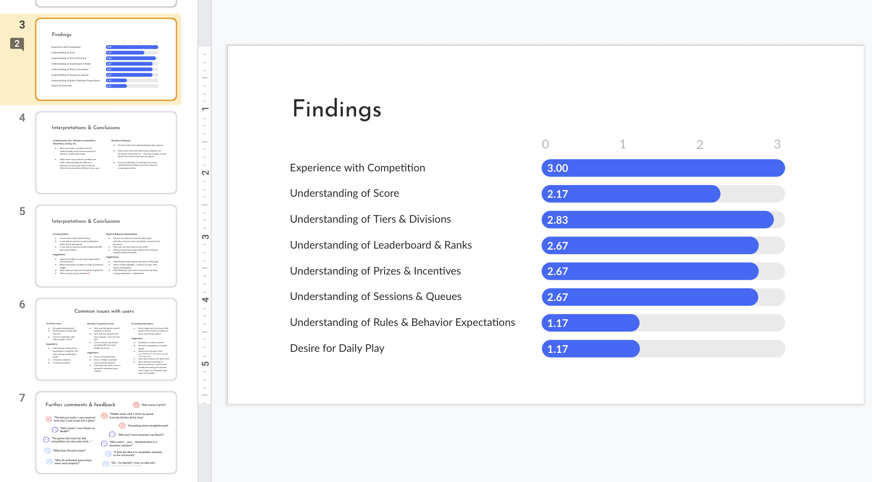
The discovery phase involved close collaboration among company founders, the product owner, and myself. We rapidly generated and refined ideas through both remote and in-person brainstorming sessions. Subsequently, we validated our concepts by engaging with users, addressing everything from league format and gameplay rules to complex concepts like tiers, scoring, and reporting systems.
Our research informed the product design process, enabling us to create mockups that incorporated our discovery and research insights. We would then repeat this cycle: translating our design solutions into prototypes and testing them with users, followed by further iterations and discussions with stakeholders. Rinse and repeat, until we solved 80-90% of the problem, and then handed off screens to developers.
We talked with users near daily during the design and development process. Even post-launch, UX research shifted it’s focus to improving engagement, registration, and user play rates. With regular UX research sessions, our team shipped targeted fixes weekly.
UI & Visual Design
I approached the creation of the interface with two main ideas: utilizing metaphors and concepts from Dota 2’s in-game UI, and adopting an overall structure and format reminiscent of Elo’s flagship product, Dotabuff. My aim was to provide users with a familiar experience, while also incorporating the effects and animations expected from an in-game UI.
Thanks to extensive UX planning and the use of pre-existing components from Dotabuff, I had considerable freedom to create a visually distinct experience for Reach. Collaborating closely with partners in product and engineering, we were able to deliver detailed and highly interactive pages within days, a testament to our thorough upfront planning. We set our goals high—and we delivered.